
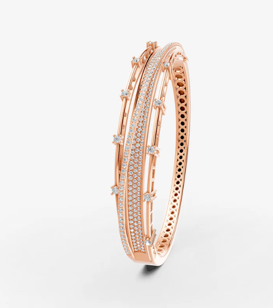
A jewelry design can contain beautiful materials and still feel visually unbalanced when its parts do not work together. One large stone may dominate a small pendant, or heavy decorations may make a simple ring look crowded. On bestsimpledesign.com, readers can explore practical design principles that help jewelry feel more coordinated. Balance does not require every side to look identical. It means the different elements support one another and create a clear overall appearance.
Understand Visual Weight
Visual weight describes how strongly an element attracts attention. Large stones, dark colors, bright surfaces, and detailed patterns can appear more prominent than small or pale elements. Designers need to consider these differences when arranging components. A single dark gemstone may attract more attention than several tiny clear stones, even when the clear stones occupy more space.
Understanding visual weight helps explain why some designs feel uneven at first glance. The problem may not be the size of a component alone. Its color, position, shape, and surrounding details can also influence the result. Designers can adjust these factors before deciding that a material needs to be replaced. Sometimes a small change in placement creates a more balanced appearance without changing the overall concept.
Choose A Clear Focal Point
Many successful jewelry pieces have one main feature that attracts attention first. This might be a gemstone, an unusual pendant shape, an engraved detail, or a carefully arranged group of beads. Supporting elements should help that feature stand out instead of competing with it. Without a clear focal point, the design may feel scattered.
The focal point should suit the size and purpose of the jewelry. A statement necklace can support a larger centerpiece, while small earrings may need a more restrained feature. Designers should also think about viewing distance because some details are noticeable only when the jewelry is held close. A clear focal point makes the design easier to understand and helps the remaining details feel more intentional.
Balance Shape And Size
Shapes influence how jewelry feels even before color and texture are considered. Rounded forms can soften a design, while straight lines and sharp angles create a more structured appearance. Mixing these shapes can produce interest, but the proportions need attention. A large angular component may overwhelm several delicate curved elements if their sizes are not considered carefully.
Size relationships should match the intended style. A small pendant may look balanced on a fine chain, while a heavier pendant often needs a chain with suitable strength and visual presence. The same principle applies to rings, bracelets, and earrings. Designers can compare the main component with the surrounding elements before final assembly. Small adjustments to width, spacing, or scale may improve the whole piece without requiring a complete redesign.
Use Space More Carefully
Empty space is an important part of jewelry design because it allows individual details to remain visible. When stones, charms, or decorative marks sit too close together, their shapes can merge into one crowded area. Giving each element enough room can create a cleaner appearance and make the main design easier to recognize.
This does not mean every piece should be minimal. Detailed jewelry can look attractive when its patterns have a clear arrangement. The key is deciding where detail belongs and where the design needs breathing room. A necklace may use a decorative centerpiece with a simpler chain, while a patterned ring may benefit from leaving its edges relatively clean. Space can provide contrast without adding another material or color.
Coordinate Colors And Finishes
Different colors and surface finishes can either support or distract from the overall composition. A polished metal surface reflects more light than a matte finish, which can make it appear more prominent. Similarly, a bright gemstone may draw attention away from a smaller decorative detail. Designers should compare materials together rather than selecting each one independently.
Using related colors can create a coordinated appearance, while controlled contrast can make selected elements stand out. Both approaches can work when the purpose is clear. A design with several contrasting stones may need a quieter metal finish to avoid excessive competition. A simple piece with one stone may benefit from a more reflective setting. Testing materials under ordinary lighting helps reveal how they work together in daily use.
Consider Wearability Too
Visual balance should work alongside physical comfort. A pendant that looks balanced on a table may hang unevenly when worn because its weight is concentrated on one side. Large earrings may also pull awkwardly if the attachment point does not support their shape properly. Designers should test how the piece behaves during movement instead of relying only on its appearance.
Bracelets need enough space for comfortable movement, while rings should fit without excessive pressure. Chains and clasps should support the weight of their decorative components. These details may seem separate from visual design, but they influence how the jewelry sits and moves. A well-balanced piece should remain attractive during ordinary use rather than looking correct only in a photograph or display case.
Review From Different Angles
A jewelry piece may look excellent from the front but reveal problems when viewed from the side or back. Uneven settings, bulky connections, and awkward attachment points can become visible from other angles. Rotating the piece during inspection helps designers understand how the complete structure works. This check is especially useful for pendants, rings, and statement earrings.
Photographs can support the review process because they make proportions easier to compare. Place the jewelry against a plain background and examine whether one element dominates unexpectedly. If the design feels crowded, remove unnecessary details or adjust their positions. If it looks too plain, consider whether a small texture or color contrast would help. Reviewing the design with fresh eyes often reveals practical improvements.
Conclusion
Balanced jewelry design depends on visual weight, proportion, spacing, color, and physical comfort working together. Designers do not need to make every element identical to create a coordinated result. Readers visiting bestsimpledesign.com can use these principles to review existing designs or plan new pieces with greater care. A clear focal point, suitable proportions, and thoughtful spacing often create a stronger result than adding more decoration.
Read also :-
male mehndi design simple arabic

